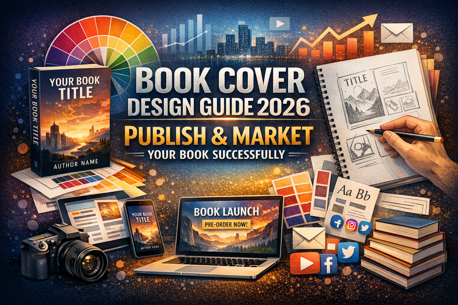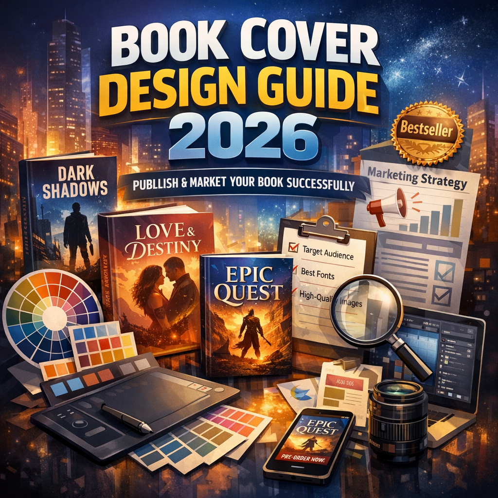
Book Cover Design Guide 2026: Complete Strategy to Successfully Publish and Market Your Book
Introduction: Why Most Books Fail Before Readers Even Open Them
Many authors spend months or years writing a book but rush the cover. The result is a design that looks amateur, unclear, or outdated. Readers judge books quickly, and the cover is the first thing they see. If it fails to impress, they never read the description.
This Book Cover Design Guide explains how to create a strong, professional cover that attracts readers and supports your marketing. You will learn the exact steps, design principles, practical tips, and mistakes to avoid so your book stands out in 2026’s competitive market.
What Is a Book Cover and Why It Matters
A book cover is more than decoration. It is your book’s main marketing tool. It communicates genre, tone, and quality in seconds.
A strong cover helps you:
-
Grab attention in online stores
-
Build credibility as an author
-
Increase click-through rates
-
Boost sales and visibility
-
Strengthen brand identity
In digital marketplaces, readers often see your cover as a small thumbnail. That means clarity and visual impact matter more than complex artwork.
Book Cover Design Guide: Step-by-Step Creation Process
Step 1: Understand Your Genre
Each genre has visual expectations. Romance covers look different from thrillers. Business books differ from fantasy novels.
Study bestselling books in your category. Look for patterns such as:
-
Common color palettes
-
Font styles
-
Image types
-
Layout structure
Do not copy designs, but learn what readers expect.
Step 2: Define Your Target Audience
Design choices depend on who you want to attract. A young adult audience prefers bold colors and modern fonts. Academic readers expect clean and simple designs.
Ask:
-
What age group is my reader?
-
What tone fits my book?
-
Should the cover feel serious or playful?
Clear answers guide design decisions.
Step 3: Choose the Right Typography
Fonts communicate emotion. Serif fonts feel traditional. Sans-serif fonts look modern. Script fonts feel elegant.
Best practices:
-
Use no more than two fonts
-
Keep title readable at small sizes
-
Avoid overly decorative fonts
-
Maintain spacing between letters
Typography should support the message, not distract from it.
Step 4: Select Strong Imagery
Images should represent the theme of your book. Avoid generic stock photos that look cheap or overused.
Good imagery should be:
-
High resolution
-
Relevant to the story
-
Emotionally engaging
-
Clear at thumbnail size
Minimal designs often work better than cluttered ones.
Step 5: Create a Balanced Layout
A strong layout guides the reader’s eye naturally. Important elements should be easy to spot.
Typical layout hierarchy:
-
Title
-
Image or artwork
-
Subtitle
-
Author name
Spacing and alignment help maintain balance. Too many elements create confusion.
Step 6: Use Color Psychology
Colors influence emotions and expectations.
Examples:
-
Red = excitement or danger
-
Blue = trust and calm
-
Black = mystery or luxury
-
Yellow = energy and optimism
Choose colors that match your book’s tone and genre.
Step 7: Optimize for Print and Digital
Modern publishing requires covers that work in multiple formats.
Ensure your design works for:
-
Paperback
-
Hardcover
-
Ebook thumbnails
-
Promotional graphics
-
Social media ads
Design files should meet printing standards such as bleed, trim size, and resolution.
Benefits of Following a Professional Book Cover Design Guide
Using a structured approach brings measurable advantages.
Better First Impressions
Readers judge a book in seconds. A polished cover signals professionalism and quality writing.
Higher Sales Potential
Books with strong covers often perform better because they attract more clicks and interest.
Stronger Author Brand
Consistent design style across books builds recognition. Readers begin to associate your name with a certain look and quality.
Easier Marketing
A well-designed cover works across ads, posters, websites, and social media without extra editing.
Best Practices for Modern Book Cover Design in 2026
Publishing trends change each year. Staying updated keeps your book competitive.
Keep Designs Simple
Minimalist covers perform well online because they stay clear even at small sizes.
Focus on Title Visibility
If readers cannot read your title instantly, the cover is not effective.
Use Professional Images
Blurry or low-quality images reduce credibility.
Test Thumbnail View
Always check how your cover looks at small sizes. Many readers shop on mobile devices.
Maintain Brand Consistency
If you write a series, keep similar colors, fonts, and layout styles.
Common Book Cover Mistakes to Avoid
Even good writers make design errors. Avoid these frequent problems.
Overcrowded Layout
Too many elements create visual noise. Simplicity improves readability.
Wrong Genre Signals
A mismatch between cover and genre confuses readers and reduces trust.
Poor Font Choice
Hard-to-read fonts make titles unclear and reduce impact.
Low Resolution Files
Pixelated covers look unprofessional and may fail printing requirements.
Ignoring Spine and Back Cover
For print books, the spine and back matter. They should match the front design and remain readable.
Book Cover Design Guide for Self-Publishing Authors
Self-publishing gives authors full control, but also full responsibility. You must ensure your cover meets industry standards.
Checklist for self-publishers:
-
Correct trim size
-
Spine width calculation
-
Print-ready PDF format
-
CMYK color mode for print
-
300 DPI resolution
-
Proper bleed margins
Skipping these steps can delay printing or cause costly revisions.
Design Elements Every Successful Cover Includes
Clear Title Hierarchy
The title should be the most visible element. Subtitles and author names should support it, not compete.
Visual Focal Point
Readers should know where to look first. A single strong focal image works best.
Contrast
Contrast improves readability. Light text on dark backgrounds or dark text on light backgrounds works well.
White Space
Empty space improves clarity and elegance. It prevents visual overload.
Print vs Digital Covers: Key Differences
Designing for print and digital requires different priorities.
Print Focus
-
Physical dimensions matter
-
Spine must be readable
-
Colors should match print output
Digital Focus
-
Thumbnail visibility
-
Strong contrast
-
Simple layout
-
Fast recognition
A professional designer ensures your cover works in both formats.
Why Authors Choose Professional Cover Designers
While some authors try DIY tools, many choose professionals for better results.
Reasons include:
-
Industry knowledge
-
Genre expertise
-
Advanced software skills
-
Access to licensed images
-
Technical print setup
-
Market-tested design methods
Professional designers also understand marketing psychology. They know how visual elements influence buying decisions.
How a Professional Publishing Company Helps
Working with a publishing company simplifies the process and improves quality.
Services often include:
-
Market research
-
Concept development
-
Custom illustration
-
Typography selection
-
Layout design
-
File formatting
-
Print preparation
-
Marketing graphics
Instead of guessing, you get expert guidance from start to finish.
Book Cover Trends Dominating 2026
Design trends evolve based on reader behavior and technology. Current trends include:
-
Bold typography-focused covers
-
Minimalist illustrations
-
High-contrast color schemes
-
Retro-inspired layouts
-
Symbolic imagery
-
Matte finish textures for print
Following trends keeps your book visually relevant while still allowing originality.
Practical Workflow Timeline for Cover Creation
A realistic design timeline helps avoid last-minute stress.
Typical schedule
Week 1 – Research and concept ideas
Week 2 – Draft design options
Week 3 – Revisions and feedback
Week 4 – Final files and formatting
Starting early ensures your cover is ready before marketing begins.
Testing Your Cover Before Publishing
Testing improves performance and reduces risk.
Ways to test:
-
Show mockups to readers
-
Run social media polls
-
Compare multiple designs
-
Ask for feedback from your target audience
Even small changes can significantly improve appeal.
Cost of Book Cover Design
Prices vary depending on quality and experience.
Typical ranges:
-
DIY tools: low cost but limited quality
-
Freelance designers: moderate cost
-
Professional agencies: higher cost but premium results
A strong cover is an investment, not an expense. It directly affects sales potential.
Quick Checklist: Is Your Cover Ready?
Use this checklist before publishing:
-
Title readable at thumbnail size
-
Genre clearly visible
-
Professional fonts used
-
Balanced layout
-
High-resolution images
-
Correct print dimensions
-
Consistent branding
-
Tested with readers
If you answer yes to all, your cover is ready for launch.