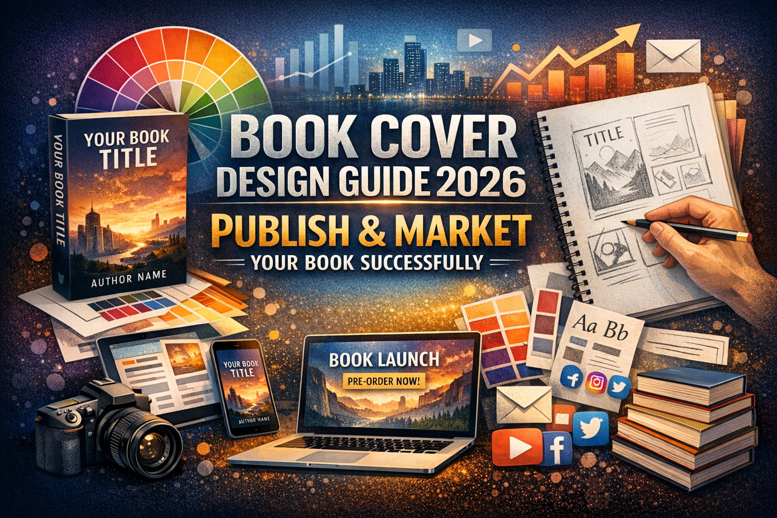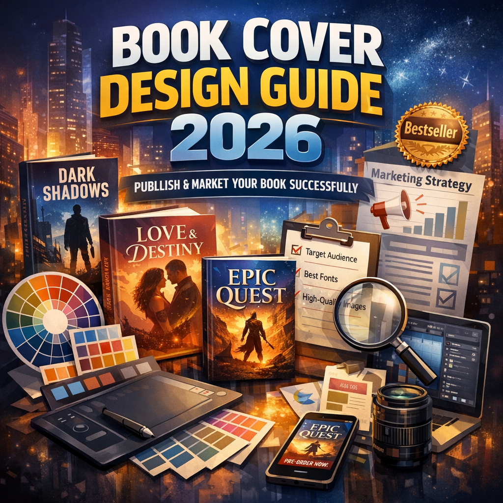
Book Cover Design Guide: Complete Strategy to Successfully Publish and Market Your Book in 2026
Introduction: Why Your Book Cover Can Make or Break Sales
Many authors spend months writing a book but only a few hours designing the cover. That’s a mistake. Readers judge books instantly, and your cover is the first thing they see. If it looks unprofessional or confusing, they won’t click, read, or buy.
This Book Cover Design Guide explains exactly how to create a cover that attracts attention, builds trust, and drives sales in 2026’s competitive publishing market. Whether you plan to self-publish or work with a publisher, mastering cover design strategy is essential.
The good news is you don’t need to be a designer. You only need to understand what works, what doesn’t, and how to apply proven principles.
Step-by-Step Book Cover Design Guide for Authors
Step 1: Understand Your Genre Expectations
Every genre has visual patterns readers expect. Romance covers look different from thrillers. Business books look different from fantasy novels.
Study best-selling books in your category and note:
-
Font styles
-
Color schemes
-
Image types
-
Layout structure
Readers should instantly recognize your genre from your cover. If they can’t, they may skip your book.
Step 2: Define Your Book’s Visual Message
Your cover must communicate three things within seconds:
-
Genre
-
Tone
-
Target audience
Ask yourself:
-
Is your book serious or humorous?
-
Is it for teens or professionals?
-
Is it emotional or informational?
Your answers determine design direction.
Step 3: Choose the Right Typography
Typography is one of the most powerful design elements. Poor font choice can ruin even a beautiful cover.
Best practices:
-
Use 1–2 fonts only
-
Make title readable at thumbnail size
-
Avoid decorative fonts for nonfiction
-
Match font mood to genre
Large, bold titles work best for digital marketplaces.
Step 4: Select Strategic Colors
Colors trigger emotions and influence buying decisions.
Examples:
-
Red = urgency or passion
-
Blue = trust and authority
-
Black = mystery or luxury
-
Yellow = optimism and energy
Choose 2–3 main colors that support your theme. Avoid overcrowding with too many shades.
Step 5: Use High-Quality Images or Graphics
Blurry or low-resolution images signal amateur quality. Always use high-resolution visuals.
Options include:
-
Professional photography
-
Custom illustrations
-
Graphic compositions
-
Minimalist designs
In 2026 trends, clean and simple covers often outperform cluttered ones.
Step 6: Create a Balanced Layout
Good design is not decoration. It’s structure.
Your layout should:
-
Guide the eye naturally
-
Highlight the title first
-
Keep spacing consistent
-
Avoid crowding elements
White space is important. It improves readability and makes your cover look modern.
Step 7: Test Your Cover Before Publishing
Never publish without testing. What looks good to you may not work for readers.
Testing methods:
-
Show multiple designs to readers
-
Run polls
-
Get feedback from genre fans
-
Compare thumbnail visibility
Small tweaks can dramatically improve performance.
Benefits of Following a Professional Book Cover Design Guide
Authors who follow structured design principles gain major advantages.
1. Strong First Impression
Readers decide within seconds whether a book looks worth reading. A polished cover signals professionalism and credibility.
2. Higher Click-Through Rates
Online bookstores display covers as thumbnails. Clear titles and strong visuals increase clicks and interest.
3. Better Branding
Consistent design style helps readers recognize your work. This is especially important for authors writing multiple books or series.
4. Increased Sales Potential
A strong cover attracts attention, builds trust, and encourages purchases. Even excellent writing struggles without appealing presentation.
5. Competitive Market Positioning
Thousands of books launch every day. Professional design helps your book stand out instantly.
Best Practices from Publishing Experts
To succeed in modern publishing, follow these proven strategies.
Keep It Simple
Minimal designs often perform better than complex ones. Focus on one main visual idea instead of many competing elements.
Design for Thumbnails First
Most readers see your cover online before they see it in print. If your cover looks clear at small size, it will work everywhere.
Prioritize Title Visibility
Your title should be readable from a distance. If readers must zoom in, your design needs improvement.
Stay Consistent With Branding
If you plan a series, keep a consistent style:
-
Similar fonts
-
Matching layouts
-
Coordinated colors
Consistency builds recognition.
Follow Market Trends Carefully
Design trends evolve. In 2026, popular trends include:
-
Bold typography covers
-
Minimalist layouts
-
Flat illustration styles
-
Strong contrast colors
However, trends should guide—not control—your design.
Common Book Cover Mistakes to Avoid
Many authors unintentionally sabotage their book’s success through poor cover choices.
Using Too Many Fonts
More than two fonts create confusion and reduce professionalism.
Choosing Generic Stock Images
Overused images make your book look unoriginal. Readers notice repetition quickly.
Ignoring Genre Conventions
If your cover doesn’t match reader expectations, they may assume it’s the wrong type of book.
Overcrowding the Design
Adding too many elements makes covers look cluttered and amateur.
Poor Contrast
Low contrast between text and background makes titles hard to read.
Designing Without Feedback
Designing alone often leads to biased decisions. Always test with real readers.
Why Authors Should Consider Professional Cover Design Services
While DIY tools exist, professional designers offer advantages that often justify the investment.
Expertise in Market Psychology
Professional designers understand what attracts readers in specific genres. They design strategically, not randomly.
Industry Standard Formatting
Publishers and online retailers have technical requirements for:
-
Trim sizes
-
Bleed margins
-
Spine width
-
Resolution
Professionals ensure your cover meets all standards.
Custom Visual Identity
A designer can create a unique look tailored to your book’s theme, helping you stand out in crowded marketplaces.
Time Savings
Designing takes hours of testing and revision. Hiring a professional lets you focus on writing and marketing.
Higher Perceived Value
Books with professional covers look more credible. Readers often associate design quality with writing quality.
DIY vs Professional Design: Which Should You Choose?
Choosing between DIY and professional design depends on your goals.
DIY works best if:
-
You have design experience
-
You understand typography
-
You know market trends
-
You’re publishing casually
Professional design is better if:
-
You want strong sales
-
You’re building an author brand
-
You plan long-term publishing
-
You lack design skills
For serious publishing goals, professional design usually delivers better results.
Advanced Tips to Maximize Cover Performance in 2026
To stay competitive, apply these advanced strategies.
Use Data-Driven Design Decisions
Study successful books in your niche. Identify patterns in top sellers and apply similar design logic.
Optimize for Multiple Formats
Your cover should work in:
-
Print
-
Ebook
-
Audiobook
-
Ads
-
Social media
Design flexibility ensures consistent branding.
Think Like a Reader, Not an Author
Authors often design covers based on personal taste. Readers care about clarity, emotion, and relevance.
Design for them—not for yourself.
Consider Marketing Use
Your cover will appear in:
-
Ads
-
Social media posts
-
Email campaigns
-
Author websites
Make sure your design looks strong across all platforms.
Checklist Before Finalizing Your Cover
Use this quick checklist to ensure your design is ready.
-
Title readable at thumbnail size
-
Genre clear at first glance
-
Fonts limited to two
-
Colors consistent
-
Layout balanced
-
Image high resolution
-
Feedback tested
-
Branding aligned
If every box is checked, your cover is ready for publishing.