Professional Book Formatting Secrets Publishers Use
Introduction: Why Professional Book Formatting Matters More Than You Think
Many authors believe that writing a great manuscript is enough to create a successful book. However, even the best-written content can look unprofessional if the formatting is poor. Readers notice formatting immediately. Uneven margins, inconsistent fonts, and awkward spacing can make your book look amateur and reduce its credibility.
Professional publishers understand that presentation is just as important as content. They use proven professional book formatting techniques to make books visually appealing, easy to read, and ready for print and digital platforms.
Proper formatting improves readability, strengthens your brand as an author, and ensures your book meets publishing standards. In this guide, you will discover the exact formatting secrets publishers use to create professional-quality books.
What Is Professional Book Formatting?
Professional book formatting is the process of designing and arranging your manuscript so it meets industry standards for print and eBook publishing. It includes adjusting fonts, spacing, margins, page layout, headings, and structure.
The goal is simple: create a smooth and comfortable reading experience.
Professional formatting ensures:
-
Clean and consistent layout
-
Proper spacing and alignment
-
Easy navigation for readers
-
Compatibility with publishing platforms
-
A polished and credible appearance
Without proper formatting, your book may look unfinished—even if the writing is excellent.
Why Publishers Focus So Much on Professional Book Formatting
Publishers know that formatting affects reader experience and sales. A well-formatted book builds trust and encourages readers to continue reading.
Key benefits of professional book formatting:
-
Improves readability
-
Enhances visual appeal
-
Increases reader satisfaction
-
Strengthens author credibility
-
Reduces printing errors
-
Meets publishing platform requirements
A professional layout helps your book compete with traditionally published titles.
Secret #1: Choosing the Right Font for Readability
One of the most important professional book formatting secrets is selecting the right font. Publishers choose fonts that are easy to read and visually pleasing.
Best fonts for print books:
-
Garamond
-
Times New Roman
-
Palatino
-
Georgia
-
Baskerville
These fonts are designed for long-form reading and reduce eye strain.
Best fonts for eBooks:
-
Georgia
-
Arial
-
Helvetica
-
Bookerly
Avoid decorative or fancy fonts. They may look attractive but reduce readability.
Recommended font size:
-
Print books: 10–12 pt
-
eBooks: Flexible, but usually 11–12 pt equivalent
Consistency is key. Do not mix multiple fonts in the main text.
Secret #2: Perfect Margin Settings Create Balance
Margins create white space around your text, making it easier to read and visually balanced.
Professional publishers use specific margin standards.
Recommended margin settings for print books:
-
Top: 0.75" to 1"
-
Bottom: 0.75" to 1"
-
Inside (gutter): 0.75" to 1"
-
Outside: 0.5" to 0.75"
The gutter margin is especially important. It prevents text from disappearing into the book binding.
Proper margins give your book a clean, professional look.
Secret #3: Line Spacing Improves Reading Comfort
Line spacing affects how easy your book is to read. Professional publishers avoid cramped text.
Standard line spacing:
-
Print books: 1.15 to 1.5
-
eBooks: Flexible and responsive
Too little spacing makes reading difficult. Too much spacing wastes pages.
Balanced spacing improves reader comfort and enhances the visual experience.
Secret #4: Proper Paragraph Formatting Makes Books Look Professional
Paragraph formatting is one of the most noticeable elements of professional book formatting.
Publishers use specific paragraph styles.
Standard paragraph rules:
-
First-line indent: 0.25" to 0.5"
-
No extra space between paragraphs
-
Left-aligned text (not justified for some eBooks)
-
Consistent indentation throughout
Avoid using tabs or manual spacing. Instead, use paragraph settings.
This ensures consistency across the entire book.
Secret #5: Chapter Formatting Creates Structure
Professional publishers design chapters carefully to create a smooth flow.
Standard chapter formatting includes:
-
Starting each chapter on a new page
-
Centered chapter titles
-
Larger font size for chapter headings
-
Consistent spacing above and below headings
Example structure:
Chapter Title
Space
Body text begins
This helps readers navigate your book easily.
Secret #6: Proper Page Size Selection Matters
Page size affects printing costs, readability, and appearance.
Professional publishers choose standard trim sizes.
Common book sizes:
-
5" x 8" – Fiction and novels
-
5.5" x 8.5" – General nonfiction
-
6" x 9" – Most professional books
-
8.5" x 11" – Workbooks and manuals
Choosing the right size improves readability and reduces printing costs.
Secret #7: Headers and Footers Improve Navigation
Headers and footers help readers navigate your book.
Professional publishers include:
Headers:
-
Book title on one side
-
Chapter title on the other side
Footers:
-
Page numbers centered or aligned
The first page of each chapter usually does not include headers or footers.
This creates a clean and professional appearance.
Secret #8: Professional Page Number Placement
Page numbers are essential for navigation.
Standard placement options:
-
Bottom center
-
Bottom right or left
-
Top corners
Avoid placing page numbers on chapter opening pages.
Consistency is critical.
Secret #9: Proper Alignment and Justification
Professional publishers often justify text in print books.
Justified text creates clean edges on both sides.
Benefits include:
-
Professional appearance
-
Improved readability
-
Balanced page layout
However, some eBooks use left alignment for better compatibility.
Secret #10: Front Matter and Back Matter Formatting
Professional book formatting includes properly structured front and back matter.
Front matter includes:
-
Title page
-
Copyright page
-
Dedication page
-
Table of contents
-
Preface or introduction
Back matter includes:
-
Acknowledgments
-
Author bio
-
Index (optional)
-
About the author
-
Additional books
These elements improve professionalism and reader experience.
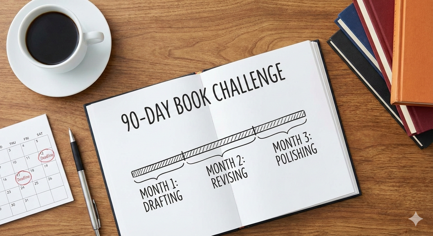
Step-by-Step Professional Book Formatting Process
Here is the exact process publishers follow.
Step 1: Clean the manuscript
Remove:
-
Extra spaces
-
Manual line breaks
-
Inconsistent fonts
-
Tabs and formatting errors
Step 2: Apply consistent styles
Use defined styles for:
-
Body text
-
Chapter titles
-
Headings
-
Paragraphs
This ensures consistency.
Step 3: Set margins and page size
Choose trim size and apply proper margins.
Step 4: Format chapters and headings
Ensure consistent chapter structure.
Step 5: Add headers, footers, and page numbers
Apply standard placement rules.
Step 6: Review and proof visually
Check for:
-
Alignment errors
-
Spacing issues
-
Layout problems
This final review ensures professional quality.
Professional Book Formatting for eBooks vs Print Books
Print and eBooks require different formatting approaches.
Print formatting focuses on:
-
Fixed layout
-
Exact margins
-
Page numbers
-
Print-ready PDF
eBook formatting focuses on:
-
Flexible layout
-
Responsive text
-
Clickable table of contents
-
Device compatibility
Professional publishers format separately for both versions.
Common Professional Book Formatting Mistakes to Avoid
Many authors make formatting mistakes that hurt their book's quality.
Mistake #1: Using multiple fonts
This creates an inconsistent and unprofessional look.
Mistake #2: Incorrect margins
Improper margins make books harder to read.
Mistake #3: Inconsistent spacing
Spacing errors make books look messy.
Mistake #4: Manual formatting
Manual formatting causes inconsistency.
Always use styles instead.
Mistake #5: Ignoring trim size
Trim size affects layout and printing.
Choose correctly from the start.
Mistake #6: Poor chapter formatting
Inconsistent chapter design confuses readers.
Benefits of Professional Book Formatting for Authors
Professional formatting offers major advantages.
1. Builds credibility
Your book looks professional and trustworthy.
2. Improves reader experience
Readers enjoy clean and readable layouts.
3. Increases sales potential
Professional books attract more buyers.
4. Meets publishing standards
Your book gets approved faster.
5. Strengthens your author brand
Professional presentation builds authority.
Why Authors Should Choose Professional Book Formatting Services
Professional formatting requires technical knowledge and precision.
Professional services offer:
-
Industry-standard formatting
-
Error-free layouts
-
Print and eBook compatibility
-
Time savings
-
Better quality results
Experts understand platform requirements and ensure your book meets all standards.
This reduces stress and improves overall quality.
Best Practices Publishers Always Follow
Professional publishers follow strict formatting practices.
Key best practices include:
-
Consistent fonts and spacing
-
Standard trim sizes
-
Proper paragraph styles
-
Clean chapter formatting
-
Professional headers and footers
-
Careful proofreading
These practices ensure professional results.
How Professional Book Formatting Impacts Book Sales
Readers judge books by appearance.
A professional layout:
-
Builds trust
-
Improves reading comfort
-
Encourages positive reviews
-
Increases recommendations
Professional formatting directly impacts your success as an author.
Conclusion: Professional Book Formatting Is the Key to Publishing Success
Professional book formatting is not just a technical step—it is a critical part of publishing success. Publishers use proven formatting techniques to create books that look polished, readable, and credible.
By applying professional book formatting standards, you improve reader experience, strengthen your brand, and increase your book’s market value.
Whether you publish independently or through a company, investing in professional formatting ensures your book meets industry standards and competes with the best.
A professionally formatted book reflects professionalism, builds trust, and sets the foundation for long-term success in publishing.